I was tasked with designing the overall brand for upcoming personal trainer Riley Jordan. Riley’s vision for the coaching brand was to create a natural, earthy, and sterile palette with clean typography and fonts that felt very balanced.
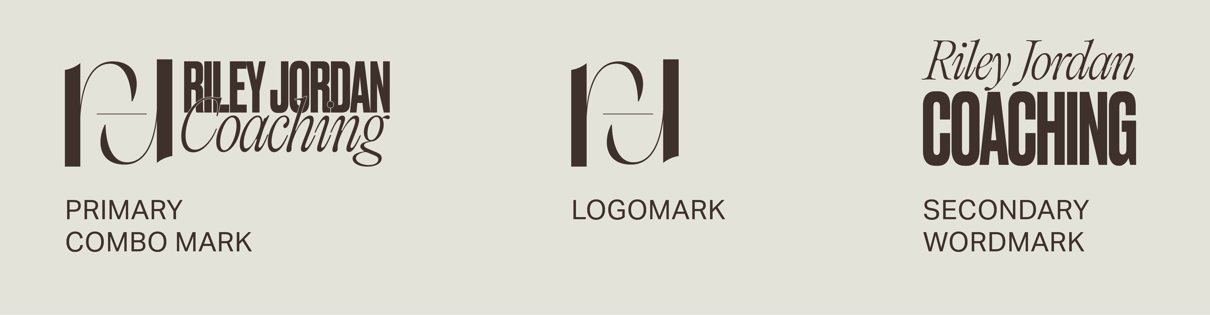
The end result was a logomark that contained a line to show balance + equilibrium along with a balanced R and J mark.
![](https://freight.cargo.site/t/original/i/3ec12d6830c6ad88125ac263eae5f6a54afcd550b593487a10fb5976e050c8a9/RJ-Coaching-Logomark3x.png)
![](https://freight.cargo.site/t/original/i/53fcee77d364b53779e003b964c83a4f68365f20ab3ec81e708c9a41acbd8913/RJC-Logos3x.png)
![](https://freight.cargo.site/t/original/i/d385283d9d4d72667f95991af1c4293abee8392c7586699d1234ccf9b7531ac9/RJC-Colors3x.png)
![](https://freight.cargo.site/t/original/i/0759f4bc06e0af6ffc05dc7201bf5291ea4e1c180837bfacc3faedada9f9ef4d/RJC-Typography_13x.png)